
Bundled templates
Frame Job comes with 23 ready-made motion graphics: titles, pointers for screencasts, social pieces, charts and timers. Insert one, fill in its text and colours, and it’s an ordinary graphic clip that you can change as far as you like, down to the code that draws it.
- Menu
- Insert ▸ Graphic…
- Where
- Clip tab ▸ Graphic ▸ Properties
- Agent tools
list_graphicsinsert_graphic
The bundled templates
Section titled “The bundled templates”The Insert Graphic sheet lists the templates under four categories: Titles & Text, Screencast, Social & YouTube, and Data & Time. An overlay is transparent, so whatever is on the tracks below shows around it. A card fills the whole frame and hides what’s below.
| Template | Category | Kind | Default length | At 30 fps |
|---|---|---|---|---|
| Arrow highlight | Screencast | Overlay | 90 frames | 3 s |
| Bar chart | Data & Time | Card | 150 frames | 5 s |
| Callout | Screencast | Overlay | 90 frames | 3 s |
| Chapter card | Titles & Text | Card | 120 frames | 4 s |
| Countdown | Data & Time | Overlay | 330 frames | 11 s |
| Counter | Data & Time | Overlay | 90 frames | 3 s |
| Donut chart | Data & Time | Card | 150 frames | 5 s |
| End screen | Social & YouTube | Card | 300 frames | 10 s |
| Gauge | Data & Time | Overlay | 120 frames | 4 s |
| Handle tag | Social & YouTube | Overlay | 120 frames | 4 s |
| Keyboard keys | Screencast | Overlay | 90 frames | 3 s |
| Kinetic type | Titles & Text | Card | 150 frames | 5 s |
| Line chart | Data & Time | Card | 150 frames | 5 s |
| Logo reveal | Titles & Text | Card | 120 frames | 4 s |
| Lower third | Titles & Text | Overlay | 150 frames | 5 s |
| News ticker | Titles & Text | Overlay | 300 frames | 10 s |
| Progress bar | Data & Time | Overlay | 120 frames | 4 s |
| Quote card | Titles & Text | Card | 150 frames | 5 s |
| Social popup | Social & YouTube | Overlay | 120 frames | 4 s |
| Step badge | Screencast | Overlay | 90 frames | 3 s |
| Subscribe button | Social & YouTube | Overlay | 150 frames | 5 s |
| Title card | Titles & Text | Card | 120 frames | 4 s |
| Window frame | Screencast | Overlay | 150 frames | 5 s |
Insert a template
Section titled “Insert a template”-
Move the playhead to where the graphic should start.
-
Choose Insert ▸ Graphic…, then a category, then a template. The preview plays it on a loop at your project’s canvas shape.
-
Choose Insert, press Return, or double-click the template.
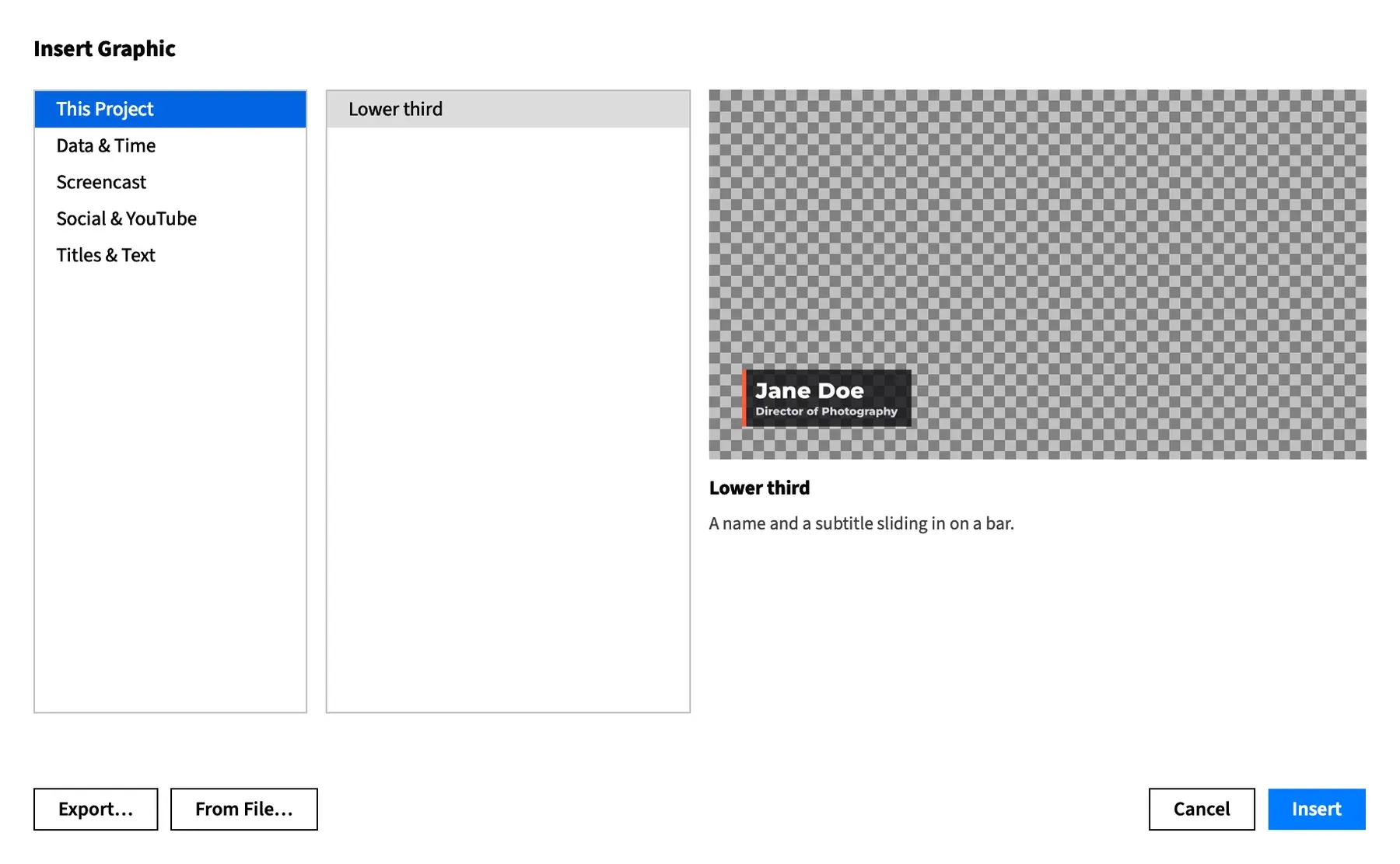
The clip lands at the playhead, on the front track when it fits there, and otherwise on a new track above everything else. Insert a graphic covers the whole sheet.
Change what a template shows
Section titled “Change what a template shows”Select the clip and open the Graphic sub-tab of the Clip tab. Properties has one row for each property the template offers, under the template’s own short name, such as boxWidth. A number with a range is a slider and a field, a number without one is a field, a yes-or-no choice is a checkbox and a fixed set of choices is a pop-up.
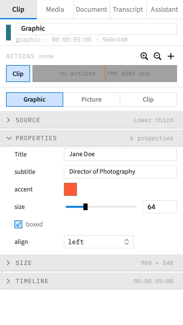
See Graphic properties for how the rows behave, and Animate graphic properties to change a value over time.
How long a template runs
Section titled “How long a template runs”The default length is in frames at your project’s frame rate, so a 150-frame template is 5 seconds in a 30 fps project and 2.5 seconds in a 60 fps one.
To change how long a graphic runs, drag the clip’s end on the timeline. Follow Clip is on for a new clip, so the exit moves with the clip’s end and the entrance still plays from the first frame. A few templates also time something else by the clip’s length:
| Template | What follows the clip’s length |
|---|---|
| Counter | Reaches its final number about 70 % of the way through. |
| Progress bar | Reaches its value about 60 % of the way through. |
| Subscribe button | The first click lands 40 % of the way through. |
Countdown and News ticker run in real time whatever the clip’s length. To fix a graphic’s length so it no longer follows the clip, see The graphic’s own timeline.
Titles & Text
Section titled “Titles & Text”Chapter card
Section titled “Chapter card”A card with a large outlined chapter number, a kicker beside it, an accent rule drawing across and the title rising into view.
| Property | What it does | Default |
|---|---|---|
| number | The chapter number, 0 to 99, always shown as two digits. | 1 |
| kicker | The small text beside the number. It wraps, shrinking to stay within three lines, down to a smallest size. | CHAPTER |
| title | The title under the rule, fitted to the width. | Getting started |
| background | The card’s colour. | #0b0b10 |
| accent | The number’s outline and the rule. | #ff5a36 |
Kinetic type
Section titled “Kinetic type”A sentence shown word by word, each word springing in, on a near-black card. Every fifth word, counting from the fourth, takes the accent colour.
| Property | What it does | Default |
|---|---|---|
| text | The sentence. | Make something people want to watch twice, then cut it in half |
| stagger | Frames between one word and the next, 1 to 30. | 4 |
| color | Most of the words. | #ffffff |
| accent | The fourth word, the ninth, the fourteenth and so on. | #ffd60a |
The sentence wraps at 80 % of the canvas’s width, at one fixed size, and centres on the frame. A long one can run off the top and bottom, so split it across two clips. The card’s colour isn’t a property.
Logo reveal
Section titled “Logo reveal”A card on which an accent bar sweeps across, revealing your logo or a text mark. The bar then settles into a short rule, and a tagline fades up under it.
| Property | What it does | Default |
|---|---|---|
| logo | A picture to reveal. None draws the mark instead. | None |
| mark | The text to reveal when there’s no picture, fitted to the width. | FRAME JOB |
| tagline | The line under the rule. Leave it empty for none. | Edit at the speed of thought |
| background | The card’s colour. | #0b0b10 |
| accent | The bar and the rule. | #ff5a36 |
The logo pop-up lists the pictures added to the project’s graphics, so add yours first with File ▸ Add Image to Graphics…. See Fonts and pictures in graphics. The picture keeps its proportions inside a box half the width of the title-safe area.
Lower third
Section titled “Lower third”A name and a subtitle that slide in from the left and fade out, on a dark bar with an accent edge.
| Property | What it does | Default |
|---|---|---|
| Title | The name. | Jane Doe |
| subtitle | The line under it. | Director of Photography |
| accent | The bar at the left edge. | #ff5a36 |
| size | The size of the name, 12 to 200. The subtitle is half of it. | 64 |
| boxed | Draws the dark box behind the text. The accent bar stays either way. | On |
| align | Puts the whole block left, center or right. The text inside it stays left-aligned. |
left |
The box grows to fit the longer line, and the text isn’t shrunk to fit. A long name at a large size can run off the frame.
News ticker
Section titled “News ticker”A band along the foot of the frame with a headline box at its left and items crawling right to left, with an accent dot between them. Type the items in one field, separated by a vertical bar (|). They repeat for as long as the clip runs.
| Property | What it does | Default |
|---|---|---|
| headline | The text in the box. Leave it empty for no box. | BREAKING |
| items | The items, separated by a vertical bar. | Three sample lines |
| speed | How fast they crawl, 40 to 600, in pixels a second when the canvas’s shorter side is 1080, and in proportion on others. | 160 |
| background | The band’s colour, slightly see-through. | #101014 |
| accent | The headline box, the band’s top edge and the dots. | #e5322d |
Quote card
Section titled “Quote card”A card with a large quote mark, the quote’s lines fading up in turn, and a short rule and the attribution sliding in.
| Property | What it does | Default |
|---|---|---|
| quote | The quote, in a text area. | Good editing is invisible. All anyone should notice is the story. |
| attribution | Who said it, drawn after a dash. Leave it empty for no name. | The Editor |
| background | The card’s colour. | #101014 |
| accent | The quote mark and the rule. | #ffd60a |
The quote shrinks and wraps to fit the frame. It wraps by itself, so line breaks you type are treated as spaces.
Title card
Section titled “Title card”A title fitted to the frame with a kicker above it, over a diagonal two-colour gradient. The text fades in and rises, then fades out over the last 18 frames, and the gradient stays.
| Property | What it does | Default |
|---|---|---|
| title | The title, fitted to 80 % of the canvas’s width. | The Long Road to a Motion Graphic |
| kicker | The small line above it. | CHAPTER ONE |
| from | The gradient’s top-left colour. | #1b2a6b |
| to | The gradient’s bottom-right colour. | #c2185b |
Screencast
Section titled “Screencast”Arrow highlight
Section titled “Arrow highlight”Points at something on a screen recording: a rounded box drawn on around a spot, an arrow growing toward it from the side nearer the frame’s centre, and a label at the arrow’s tail.
| Property | What it does | Default |
|---|---|---|
| x, y | The spot, as a fraction of the frame’s width and height, 0 to 1. | 0.62, 0.42 |
| boxWidth, boxHeight | The box’s size, as a fraction of the frame, 0.02 to 0.8. | 0.22, 0.14 |
| shape | box+arrow, box or arrow. |
box+arrow |
| label | The text. Leave it empty for none. | Look here |
| accent | The box and the arrow. | #ffd60a |
With box the label sits under the box, or above it when there’s no room. With arrow the arrow points at the spot itself and the two box sizes do nothing. The box, arrow and label are always kept inside the title-safe area, so a spot near the edge is moved in.
Callout
Section titled “Callout”A circle that draws itself round a spot, with an arrow and a label.
| Property | What it does | Default |
|---|---|---|
| x, y | The circle’s centre, as a fraction of the frame’s width and height, 0 to 1. | 0.62, 0.4 |
| label | The text at the arrow’s tail. | Click here first |
| color | The circle and the arrow. | #ff3b30 |
The arrow always comes from the lower left, and nothing keeps it on the frame. Near the left or bottom edge the arrow and label run off, so use Arrow highlight there.
Keyboard keys
Section titled “Keyboard keys”A shortcut drawn as keycaps that pop in one after another and are then pressed in turn, with a label under them.
| Property | What it does | Default |
|---|---|---|
| keys | The keys, joined by +. |
cmd+shift+4 |
| label | The line under the keys. Leave it empty for none. | Screenshot a selection |
| theme | light or dark keycaps. |
light |
| position | bottom, center or top. |
bottom |
| accent | The small bar on each keycap. | #ff5a36 |
The names in keys can be in any case:
| Type | To draw |
|---|---|
cmd, command or ⌘ |
⌘ |
shift or ⇧ |
⇧ |
opt, option, alt or ⌥ |
⌥ |
ctrl, control or ⌃ |
⌃ |
up, down, left, right |
An arrow |
plus |
The + key |
| One character | That character, in capitals |
Anything longer, such as esc |
That word on a wider keycap |
A long row of keys shrinks to fit the frame. A clip needs at least 25 frames plus 10 for each key to press them all before its exit, so a shortcut of seven or more keys wants longer than the default 90 frames.
Shortcut overlays places clips drawn by this template for you, from the shortcuts in a screen recording.
Step badge
Section titled “Step badge”A numbered accent circle popping in at a corner, with a label panel wiping out from behind it.
| Property | What it does | Default |
|---|---|---|
| number | The step’s number, 0 to 99. | 1 |
| label | The panel’s text. Leave it empty for no panel. | Open the export sheet |
| position | top-left, top-right, bottom-left or bottom-right. |
top-left |
| accent | The circle. | #ff5a36 |
Window frame
Section titled “Window frame”A browser or app window’s frame to sit over a screen recording: a title bar with three dots, a title or an address field, and a rounded outline. The inside stays clear.
Put the recording on a track below the frame, then use the Picture sub-tab to fit it inside the outline.
| Property | What it does | Default |
|---|---|---|
| style | browser draws back and forward arrows and an address field. window draws a title. |
browser |
| title | The title, shown with the window style. |
Frame Job |
| url | The address, shown with the browser style. |
example.com |
| theme | dark or light. |
dark |
| scale | The share of the title-safe area the frame covers, 0.5 to 1. | 0.86 |
| shadow | Draws a soft shadow outside the outline. | On |
| accent | The address field’s outline, so it has no effect with window. |
#ff5a36 |
The shadow is only as wide as the room around the frame, so it thins out as scale nears 1.
Social & YouTube
Section titled “Social & YouTube”End screen
Section titled “End screen”A card laid out for a video’s end screen: a title, two 16:9 spaces and a subscribe circle. On a landscape or square canvas the two spaces sit side by side with the circle centred under them. On a portrait canvas they’re a column.
| Property | What it does | Default |
|---|---|---|
| title | The line at the top. Leave it empty for none. | Watch next |
| videoA | The label under the first space. | Latest video |
| videoB | The label under the second space. | Best for you |
| subscribe | The label under the circle. | Subscribe |
| background | The card’s colour. | #0b0b10 |
| accent | The play buttons and the circle’s outline. | #ff5a36 |
The spaces are placeholders drawn into the picture, for the video elements you add on the platform when you publish. They don’t link to anything.
Handle tag
Section titled “Handle tag”An accent tile holding a glyph, with a pill showing your @handle expanding from behind it, at a corner.
| Property | What it does | Default |
|---|---|---|
| handle | The text in the pill. Leave it empty for no pill. | @framejob |
| glyph | play, camera, bubble, note or globe. |
play |
| position | bottom-left, bottom-right, top-left or top-right. |
bottom-left |
| accent | The tile. | #ff5a36 |
Social popup
Section titled “Social popup”A notification card rising in at a corner, with a generic avatar and a handle. Its heart, speech bubble or share arrow pops as the count ticks up by one.
| Property | What it does | Default |
|---|---|---|
| kind | like draws a heart, comment a speech bubble and share an arrow. |
like |
| handle | The name on the card. | @framejob |
| text | The comment. It shows only with comment, at most three lines, and anything further is dropped. |
Loved this edit! |
| count | The number it starts from, 0 or more. It ends one higher. | 1280 |
| position | bottom-right, bottom-left, top-right or top-left. |
bottom-right |
| accent | The heart, bubble or arrow. | #ff3b30 |
Subscribe button
Section titled “Subscribe button”A button that a cursor glides to and clicks. It turns grey with a check and its done label, then a bell pops in beside it and rings after a second click.
| Property | What it does | Default |
|---|---|---|
| label | The button before the click. | SUBSCRIBE |
| doneLabel | The button after it. | SUBSCRIBED |
| bell | Adds the bell and the second click. | On |
| position | bottom, center or top. |
bottom |
| accent | The button before the click, and the bell once it’s clicked. | #e5322d |
Data & Time
Section titled “Data & Time”The three charts read their data from text fields, with entries separated by commas:
- Values and labels pair up by position, and a value with no label has a blank one.
- An entry that isn’t a number is dropped, so the values after it line up one label earlier.
- An empty entry, such as a comma at the end, counts as 0.
Bar chart
Section titled “Bar chart”Bars growing one after another on a dark card, each with its figure above it and its label below, under a title.
| Property | What it does | Default |
|---|---|---|
| values | The bars’ values, separated by commas. | 12, 19, 7, 24, 15, 30 |
| labels | The labels, separated by commas. | Mon, Tue, Wed, Thu, Fri, Sat |
| title | The line at the top. It isn’t fitted, so keep it short. | Sessions per day |
| color | The bars. | #2d7ff9 |
The tallest bar sets the scale, and the figures are rounded to whole numbers. The card’s colour isn’t a property.
Countdown
Section titled “Countdown”A timer counting down or up, one step a second, inside a ring that empties or fills. The digits pulse on each tick, and the circle flashes in the accent colour at the end.
| Property | What it does | Default |
|---|---|---|
| from | The starting number, in seconds. | 10 |
| to | The final number. Make it greater than from to count up. | 0 |
| format | seconds shows 90, m:ss shows 1:30 and h:mm:ss shows 0:01:30. |
m:ss |
| label | The line above the digits, drawn in capitals. | Starting in |
| ring | Draws the ring. Without it the digits stay on their dark disc. | On |
| accent | The ring and the flash. | #ff5a36 |
The count runs in real seconds whatever the frame rate, so the clip’s length decides how far it gets. The default 330 frames is 11 seconds at 30 fps, which fits a ten-second count and the exit. At 60 fps that clip is 5.5 seconds, so lengthen it. For any longer count, lengthen the clip to the count plus a second.
With from and to equal there’s nothing to count: the number stands in a full ring and nothing flashes.
Counter
Section titled “Counter”A number counting from one value to another with thousands separators, a prefix and a label under it. It starts fast and slows into its final number, then holds.
| Property | What it does | Default |
|---|---|---|
| from | The starting number. | 0 |
| to | The final number. | 1284093 |
| prefix | Text right before the number. | $ |
| label | The line under it. | raised this year |
| color | The number and the label. | #f5f5f0 |
The number shows no decimals, and it isn’t shrunk to fit, so a very long one can run past the edges.
Donut chart
Section titled “Donut chart”Slices sweeping round a donut on a dark card, with the first slice’s share counting up in the centre above its label, and a legend with each share. The legend sits beside the donut on a landscape or square canvas, and below it on a portrait one.
| Property | What it does | Default |
|---|---|---|
| values | The slices’ values, separated by commas. A value below 0 counts as 0. | 45, 30, 15, 10 |
| labels | The labels, separated by commas. | Video, Audio, Graphics, Other |
| title | The line at the top. | Where the time goes |
| accent | The first slice. | #ff5a36 |
The other slices take colours from a fixed set of six, in order, repeating after the sixth. The shares are rounded to whole percentages, so they may not add up to exactly 100. The card’s colour isn’t a property.
A 270° dial with ticks, whose accent arc and needle swing to a value while the figure counts up.
| Property | What it does | Default |
|---|---|---|
| value | The reading, held between min and max. | 72 |
| min | The start of the dial. | 0 |
| max | The end of the dial. At or below min it’s taken as min plus 1. | 100 |
| label | The line inside the dial, drawn in capitals. | Speed |
| units | The line under the figure. | km/h |
| accent | The arc and the needle. | #ff5a36 |
A whole value counts in whole numbers, and any other shows one decimal place.
Line chart
Section titled “Line chart”A line drawn on through its points on a dark card, a dot popping at each one, with the last value called out in a pill.
| Property | What it does | Default |
|---|---|---|
| values | The points, separated by commas. | 12, 18, 15, 26, 22, 34, 41 |
| labels | The labels along the bottom, separated by commas. | Jan, Feb, Mar, Apr, May, Jun, Jul |
| title | The line at the top. | Monthly active users |
| area | Shades the area under the line. | On |
| accent | The line, the dots’ outlines, the shading and the pill. | #2d7ff9 |
The scale runs from 0, or from the lowest value if that’s negative, up to the highest. A single value draws one dot and no line. The card’s colour isn’t a property.
Progress bar
Section titled “Progress bar”A labelled bar on a dark plate, filling to a percentage with the figure counting, and a shine sweeping across it once it has filled.
| Property | What it does | Default |
|---|---|---|
| value | How far it fills, 0 to 100. | 68 |
| label | The text above the bar. | Rendering |
| showPercent | Shows the percentage at the right. | On |
| position | bottom, center or top. |
bottom |
| accent | The fill. | #2d7ff9 |
Any canvas shape
Section titled “Any canvas shape”Templates size themselves by the shorter side of the size they draw at, which is the canvas’s unless you change it, so nothing grows too large on a tall project.
Seventeen of them are laid out for all three shapes. Everything they draw stays inside the title-safe area, the frame less 5 % on every side, at 1920 × 1080, 1080 × 1920 and 1080 × 1080. Their entrances are a spring, a wipe or a fade, and never a move in from outside the frame. Long text is fitted or wrapped to stay inside, down to a smallest size for each text, so a paragraph typed where a title belongs can still run over.
The other six are Bar chart, Callout, Counter, Kinetic type, Lower third and Title card. They don’t keep to the title-safe area, and a left-aligned Lower third enters from beyond the frame’s left edge. Once settled, with their default text, their words sit at least 24 pixels inside a 1080 × 1920 frame. Only Title card fits its title and Kinetic type wraps its text, so check your own words on a tall canvas. Safe areas shows the title-safe guide in the preview.
A square canvas takes the landscape layout.
Templates end clean
Section titled “Templates end clean”The same seventeen each have an accent colour and leave in about their last 15 frames, so the last frame is bare. An overlay ends clear, and a card ends on its background alone. A card’s background never animates: only what’s on it moves or fades.
The other six end their own way:
| Template | At the end of the clip |
|---|---|
| Lower third | Fades out over the last 15 frames and ends clear. |
| Title card | Its text fades over the last 18 frames, leaving the gradient. |
| Bar chart, Callout, Counter, Kinetic type | Hold to the last frame and stop with the clip. |
Template fonts and glyphs
Section titled “Template fonts and glyphs”Templates draw only with fonts that come with Frame Job, so a project looks the same on any Mac. The font isn’t a property. To change it, edit the graphic’s code.
| Used for | Font |
|---|---|
| Text in most templates | Montserrat, extra bold or black |
| Digits that tick, the shares in Donut chart’s legend, Counter’s label and the figures in Bar chart | IBM Plex Mono |
| Window frame’s title and address | Source Sans 3, semibold |
| Title card’s title | Anton |
| Title card’s kicker and Bar chart’s labels | Bebas Neue |
| Callout’s label | Darker Grotesque |
Every symbol is a generic shape drawn by the template, never a brand’s artwork: the keycap symbols, the heart, the bell, the play triangle and the glyphs in Handle tag. None of them is a platform’s own logo.
Good to know
Section titled “Good to know”- Each insert copies the template into the project under a name not yet in use, such as
lower-third, thenlower-third-2. Undo takes the clip away, and the copy stays until you delete it. - Your copy is yours to change, and it stays as it was when you inserted it. Graphics in a vertical version covers the one exception.
- Most properties can change over time with an action. These keep one value for the whole clip: number in Chapter card and Step badge, values and labels in Donut chart and Line chart, keys in Keyboard keys, items in News ticker and count in Social popup.
With an agent
Section titled “With an agent”list_graphics lists the templates by category, as the sheet does. insert_graphic places one at the playhead: give it the name list_graphics shows, such as arrow-highlight, with from set to template. The reply names the project’s copy, which may be arrow-highlight-2. To fill in the properties afterwards, use set_graphic, with the names in the tables above. See Tools: graphics.